User experience (UX) design is essential to website and app design. Whether you plan to launch a new website or renovate an existing one, it’s important to make sure your design looks good and is functional and easy to use. No one wants to become frustrated by a website or mobile app that doesn’t work as it should.
A great UX design keeps users engaged and returning to your site. There are many excellent UX design examples out there. Whether you’re a seasoned designer or just starting out, these UX design portfolio examples will inspire you to create designs that users love.
What Is UX Design?
UX design refers to keeping the user’s needs and goals in mind while designing an application or website. Essentially, it is designing a website, web app, or other end-user product so that every user has the experience you want them to have.
For example, restaurants spend a lot of time and effort creating the right atmosphere and environment for their customers. That way, they are happy with the experience, and the restaurant develops a reputation based on their positive reviews. The same can be applied to the website and web app development.
Creating better UX designs involves a combination of:
- Research
- Analysis
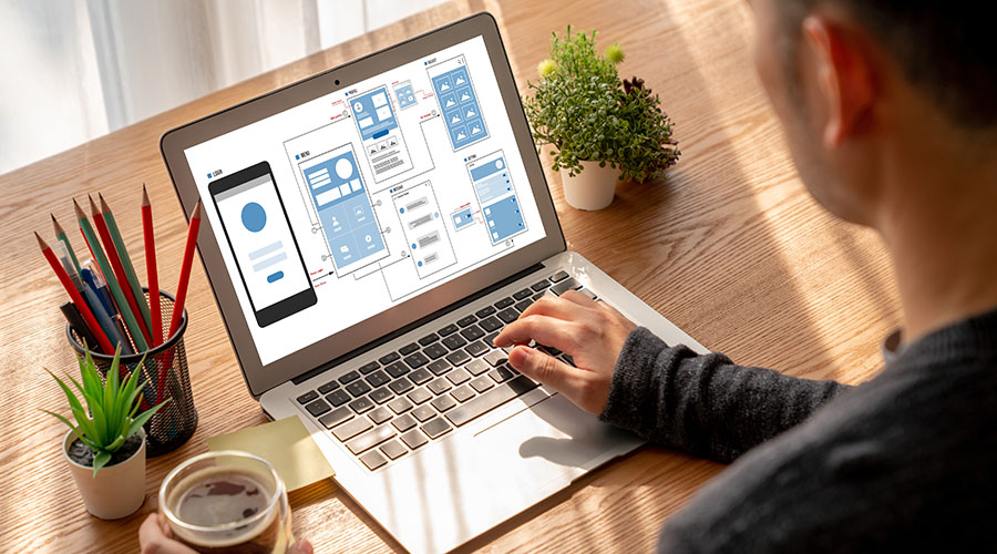
- Wireframing
- Prototyping
- Testing
A UX designer’s main goal is to make an application easy to use, engaging, and efficient. It is their responsibility to ensure:
- The interface is intuitive and visually appealing
- The information architecture is logical and easy to navigate
- The content is well-structured and relevant
If designed with UX design best practices, the final website or mobile app will feature a seamless user experience and a high level of user satisfaction. More importantly, it will eliminate potential problems that can stop users from using the app at all.
In short, you want to make it as easy and appealing as possible to use your app from the user’s perspective.
Also Read: What is UI/UX: Understanding the Fundamentals of User Interface and User Experience Design
What Makes Good UX Design?
Effective UX design means users can easily interact with a website, mobile app, or software program in a way that is both intuitive and enjoyable. Users shouldn’t need comprehensive instructions on how to use a website if it is built with them in mind. They should clearly understand how to find the information they need or the next steps to take.
There are several key elements that make good UX design, including:
- Simplicity: The site, navigation, and functionality should be simple, containing only the necessary information.
- Clarity: The purpose of buttons, navigations, and content should be immediately clear and easy to understand.
- Consistency: The performance of the site or application should be consistent. Users should have the same experience each time they visit your site.
- Empathy for users: At its core, great UX has empathy for users, as it strives to make it a better experience for them.
UX design should be aesthetically pleasing and functional and meet the needs of the end user. Many large Fortune 500 companies spend millions of dollars to ensure their websites and mobile applications are easy to use and encourage users to come back.
Bad UX design leads to frustration, confusion, and the loss of users. In many cases, the bounce rate is very high. This means users click off of a site after visiting one page instead of continuing to click through the site.
To ensure good UX design, it’s important to understand the needs and preferences of the target audience, conduct user research and testing, and iterate based on feedback.
What Does Good UX Look Like?
Good UX is characterized by an interface that is intuitive, coherent, and enjoyable to use. It meets the user’s needs and expectations while also providing a seamless user flow. The only way to know if a website or mobile application meets user needs and expectations is to do your research and ask them. To accomplish this, you have to understand the user’s goals, both in terms of why they are using the product and what they expect to get from it. UX designers can host focus groups to better identify what users want and, later, how they intuitively interact with a prototype website.
It also means providing visual clues that help users understand what they need to do next. They shouldn’t wonder what buttons to press or what information they’ll find on a certain page.
Also Read: Master the Art of UI/UX Design: A Comprehensive Guide on How to Become a UI/UX Designer
Top B2B and B2C UX Design Examples
There are several successful UX design examples in both B2B and B2C domains. These examples demonstrate how thoughtful and user-centric design can provide a competitive advantage and enhance user satisfaction. Here are some notable examples worth exploring:
Slack
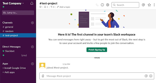
Slack is an excellent example of good UX design. Its intuitive and user-friendly interface is simple for employees to use, even if they are not savvy with new software programs. Employees basically need to accept an invitation and be added to channels. Then, they can simply message each other using a familiar interface.
Slack’s menu layouts are clear and easy to navigate. Its use of colors and customization options makes it a standout in the world of communication apps. Its simple and straightforward design makes it easy for users to quickly pick up how to use it. Slack also has a fantastic mobile app, which allows for seamless communication on the go.

Airbnb
Airbnb’s UX design example helps users navigate the platform efficiently and enhances their booking experience. With an intuitive website and mobile app, users can easily browse listings and make reservations with just a few clicks on both mobile devices and laptops. Its easy-to-use interface makes it simple for customers to make their reservations, which helped it become one of the leading vacation rental companies.
The interface of Airbnb’s website is visually appealing and user-friendly. It features high-quality images of properties and detailed descriptions that practically invite potential customers to book a vacation rental. The booking process is streamlined, with clear pricing and availability information. The ability to view reviews from other guests helps users make an informed decision about where to stay.
Airbnb’s use of personalized recommendations and alerts makes it easy for users to find and book accommodations that meet their needs and preferences. Frequent Airbnb users benefit the most, as the personalization builds based on past stays.

Apple
Apple excels in user experience design. Famously, Steve Jobs studied typography and focused on the user experience extensively from the very beginning. As a result, the company consistently creates products that are intuitive, user-friendly, and aesthetically pleasing.
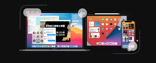
From the iPhone to the Apple Watch, each Apple product has been designed with UX best practices. This makes each product easy to use and navigate. Apple’s minimalist design, paired with high-quality materials, creates a cohesive and enjoyable user experience.
Apple’s success also stems from its ongoing commitment to keeping software up-to-date and user-friendly. User experience is about more than just design: It’s about ensuring the product is constantly improving and adapting to the needs of its users. Check out this user experience example across multiple Apple devices:

Dropbox
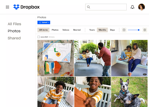
Dropbox provides a clean, simple, and intuitive UX design example that makes it effortless for users to store, share, and access files from anywhere, anytime. The app’s onboarding process is well crafted, guiding new users through the essential features and making it easy to understand how Dropbox works.
The overall design is also consistent across different devices, which means users can switch between platforms without any difficulties. Dropbox offers good accessibility features, such as keyboard shortcuts and screen reader support, to ensure everyone can use the app efficiently.

Zebi Williams
Good UX design does not need to be complicated to be effective. In fact, simple methods can be the most effective. Zebi Williams is a UX designer whose UX design portfolio examples illustrate how simplicity works best.
This UX design website combines strong imagery with an understated, yet effective, method to guide viewers’ attention to the important elements. The design is linear, taking viewers through each element in a way that makes a cohesive story.
Another lesson to be learned is the use of design patterns. When you break the pattern in the right place, it can create an impact and draw a lot of attention. Zebi does this at the call-to-action. From the top of the website, there is a green line that fraws attention from element to element. The line is vertical until the end, where it breaks at a 45-degree angle pointing to the CTA. Its an effective way to signal an important change in the content while drawing attention to the element that drives conversions.
Also Read: What’s the Difference Between UI and UX?
Learn to Incorporate UX Design Principles With Online Training
UX design can seem personal to an individual because everyone has their own ideas of how an experience should go. However, there are many standard practices and best practices that can help you create a better user experience design for your audience. You can learn how to incorporate UX design principles in an online course, like the UIUX Design Bootcamp delivered by Simplilearn in collaboration with the University of Massachusetts.
Online earning is a convenient and easy way to quickly get up to speed on a variety of topics, including UX design and how to apply it to your digital assets. Improve your UX design skills from anywhere with certified online courses. It’s never been easier to take your skills to the next level and start building your UX design example portfolio.
You might also like to read:
Essential UX Designer Interview Questions and Answers for 2023
What Is a UX Researcher and How To Become One
The Best UX Design Tools You Should Know in 2023
UI UX Designer Skills: Here’s Everything You Should Know in 2023


